
BRING OUT CONTRAST IN HAZY IMAGES
Through my experience of being a photography educator in Yosemite National Park, I realized the value in organizing this blog post and writing about a common photographic challenge we often observe in Yosemite. Since I am currently not teaching due to the park closure from COVID-19 outbreak; I am now able to give more time towards educating through my blog. I am excited to share my knowledge with you all.
One of my most common student questions is how to work with haze in a photographic image. Whether it is dust particles in the air, fumes, or smoke, Yosemite Valley presents a great amount of haziness. In photography, this can be quite annoying when the goal is to have a clear photo of El Capitan and Half Dome etc. Luckily for us, we have a few tools that we can utilize to help with this issue.

I am using my image made several years ago during the Ferguson Fire in Yosemite. Waking up for sunrise is not an easy task for me, but I made it out of bed in time and rushed to my location before the sun started peaking over the horizon. Although it was a beautiful morning with the perfect fluffy clouds in the sky, the smokey atmosphere was not ideal. So I called on my creative photographic strengths and utilized the opportunity to make a unique shot that I would of not discovered on a typical day in Yosemite. The smoke gave the sunrise a beautiful tonal quality which added to the mood of this image. This photograph is an extreme example of haziness, but I thought this would be perfect to show how much detail you can bring out in your image.
Luckily for us, there are a few tools that we can utilize to help with this issue.
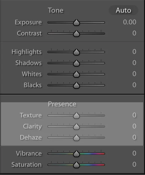
In Lightroom Classic or Camera Raw, Adobe gives us some great sliders to help bring out the contrast in our image. Along the right hand side panel, underneath the section “presence” there are three options that have worked great in these conditions: Texture, Clarity, and Dehaze. By moving these sliders, you will find that your subject will appear clearer with less haze and have more contrast. The Dehaze slider will definitely be your best friend. You probably will use this more than clarity and texture.
Making slight adjustments when using these three sliders is always best. Keep in mind that these adjustments in Lightroom and Camera Raw. This means that you are changing the whole image even though you may want more or less of the effect in certain areas of the image. You do not want your photograph to look unrealistic.

Already you can see that by making these few adjustments, there is greater contrast within the image. Although I am not done yet, there is more work to do. Once you are done making your global adjustments, put your photograph in Photoshop. We will now discuss how a Curves Adjustment Layer can be a great tool to get more contrast within your image.

Curves is all about contrast and defines the relationship between the tones in your photograph. A high contrast photo will have strong shadows, highlights, and saturation; while a low contrast photo will look flat and almost grey. This photograph is a great example of low contrast.
In a Curves layer, we can adjust the points through out the whole tonal range of the image. You will notice that the Curves represents as a straight diagonal line on the graph showing you the different tonality ranges. The lower left represents shadows, while the upper right area represents highlights. Add a point by clicking on the diagonal line. By moving the point on the line up or down, you are adjusting the shadows and highlights according to your preference. As points are added to the diagonal line and move accordingly, you will see the shape of the curve changes.
The “S” shaped Curve is the most common way to create contrast within a Curves layer. This is done by adding two points, on the shadows and highlights of the diagonal line. The steeper the S Curve, the more contrast you will receive. In this Curves adjustment layer, you can see that I made a S Curve to add a lot of contrast to my image. I wanted darker shadows and brighter highlights to create a more dynamic image and get rid as much of grey tones as possible.
If you would like to learn more about Curves, Adobe has a great tutorial HERE

I used a few adjustment Curves to create my final image. Layer Masking when needed and making the local adjustments to create contrast through out the whole image. Below shows the result of the final image.

I have had a few of my students ask if a polarizer would cut through the haziness and from my experience, it doesn’t help. Especially in this situation, a polarizer would do very little for me because they work best when the light is coming at a 90 degree angle. Luckily for us, Adobe provides useful tools to solve these problems of haziness so that our images can be shown at its greatest potential.